
SKILL.md
/iblai-vibe-credit
Add the ibl.ai credit balance widget to your app's top navigation. The widget shows the user's remaining credits, current plan, and exposes the upgrade / add-credits / manage-billing flows. It uses Stripe under the hood and is rendered by the SDK — do not build a custom version.
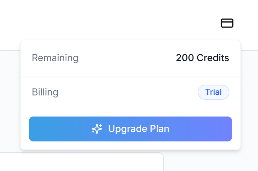
Do NOT add custom styles, colors, or CSS overrides to the <CreditBalance> component. It ships with its own styling, including the trigger icon, the dropdown panel, and the upgrade/add-credits buttons. Wrapping it, restyling it, or swapping the icon will break the upgrade flow and visual consistency across ibl.ai apps.
The widget MUST follow the canonical integration:
- Import path:
@iblai/iblai-js/web-containers(the
framework-agnostic bundle — NOT /next, NOT /sso)
redirectUrl:window.location.origin(the Stripe checkout return
URL — origin only, never .href or a path)
enabled: explicittrue- No
className: do not pass aclassNameprop unless you have a
layout reason. Never use it to swap the icon, change colors, or override the size
Visual spec
| Property | Value |
|---|---|
| Trigger | Icon-only button (Lucide CreditCard) provided by the SDK |
| Trigger size | h-5 w-5 icon inside a ghost icon button |
| Status dot | Small colored dot in the top-right of the trigger when balance is low |
| Panel width | w-[320px] dropdown |
| Position in navbar | Right side, between the page links and the notification bell |
Prerequisites
- Auth must be set up first (
/iblai-vibe-auth) - Navbar must be in place (
/iblai-vibe-navbar) @iblai/iblai-jsSDK installed- Tailwind v4 with the SDK
@sourcedirectives configured (see
Step 1 below)
- The tenant must have paywall enabled (
currentTenant.show_paywall === true).
The widget is a no-op for tenants that don't sell credits.
What this skill creates
This skill does not generate any new files — it wires <CreditBalance> from the SDK into the existing navbar. It adds:
- A
<CreditBalance>element inside the navbar's right-side cluster - The required
@sourcedirectives iniblai-styles.cssso Tailwind
generates the SDK's internal classes (the trigger icon depends on this — without it, the icon may render at the wrong size)
- The visibility gate so the widget only renders for users who can act
on it (admins or trial users, on a paywall-enabled tenant)
Step 1 — Confirm Tailwind scans both SDK source folders
The <CreditBalance> icon and panel use Tailwind utility classes authored inside the SDK's compiled JS. Tailwind v4 will not generate those classes unless the SDK's source/ directories are listed as @source.
Open app/iblai-styles.css (or app/globals.css if styles live there) and ensure BOTH directives are present:
@source "../node_modules/@iblai/iblai-js/dist/web-containers/source";
@source "../node_modules/@iblai/iblai-js/dist/web-containers/source/next";
If the app scans through a lib/iblai/sdk symlink instead (some older scaffolds ship one), the equivalent is:
@source "../lib/iblai/sdk/web-containers/source";
@source "../lib/iblai/sdk/web-containers/source/next";
Both lines are required. The source/next path covers the next-bundle classes; the SDK's icon and dropdown rely on classes from across the whole bundle. If only one is scanned, the credit icon may render at an unexpected size or without its layout utilities.
After editing, restart the dev server. Verify the build picks up the classes:
rm -rf .next && pnpm build
grep -oE 'h-5\\!|w-5\\!' .next/static/chunks/*.css | head
You should see h-5\! and w-5\! in the generated CSS.
Step 2 — Import the component
Inside your navbar component (components/navbar/nav-bar.tsx or equivalent), import CreditBalance from the framework-agnostic bundle:
import {
  CreditBalance,
  NotificationDropdown,
} from '@iblai/iblai-js/web-containers';
Do NOT import from @iblai/iblai-js/web-containers/next. The credit component does not require Next.js primitives, and the /next bundle re-exports a smaller surface — keeping all SDK widgets on the same import path simplifies the component graph.
Step 3 — Render the widget
Place <CreditBalance> inside the navbar's right-side cluster, before the notification bell:
<div className="flex items-center space-x-4">
  {showCreditBalance &&
    currentTenant?.show_paywall &&
    canViewCredits &&
    isLoggedIn && (
      <CreditBalance
        tenant={tenantKey}
        enabled={true}
        redirectUrl={window.location.origin}
        mainPlatformKey={config.mainTenantKey()}
        currentUserEmail={email}
        username={username}
      />
    )}

  <NotificationDropdown
    org={tenantKey}
    userId={username ?? ''}
    isAdmin={isAdmin}
    onViewNotifications={handleViewNotifications}
  />

  {/* Profile dropdown last */}
</div>
Required props
| Prop | Source | Notes |
|---|---|---|
tenant |
Resolved tenant key (e.g. from resolveAppTenant()) |
The tenant the user is acting under — billing is per-tenant |
enabled |
Always true |
The component itself returns null if enabled is false; pass true so it renders when the gating below passes |
redirectUrl |
window.location.origin |
Stripe checkout returns to this URL after success/cancel. Always use origin (not href or a path) so refreshes from Stripe land on a stable route |
mainPlatformKey |
config.mainTenantKey() |
The platform key from NEXTPUBLICMAINTENANTKEY — used by the upgrade flow to attribute revenue to the correct platform |
currentUserEmail |
From userData in localStorage (user_email / email) |
Stripe Checkout pre-fills with this |
username |
From userData (user_nicename / username) |
Used for the Stripe customer portal userId |
Optional props
| Prop | Default | Notes |
|---|---|---|
className |
(none) | Reserved for layout adjustments only. Do NOT use it to override the icon, colors, or sizing |
enabled |
true |
Pass false to programmatically hide the widget without unmounting it (rarely useful — prefer the gating below) |
Step 4 — Gating
The widget MUST only render when ALL of the following are true:
- The tenant sells credits —
currentTenant?.show_paywall === true.
Tenants without paywall enabled return no billing info; rendering the widget there shows a permanent error state.
- The user can act on credits — typically
isAdmin || userOnFreeTrial.
Regular users on a paid plan generally cannot top up the organization's balance, so showing them the widget is misleading. Substitute the equivalent check for your app's role model.
- The user is logged in — the widget hits authenticated billing
endpoints. Render only after auth has resolved (e.g. when tenantKey, username, and email are all populated from localStorage).
Pull these flags into the navbar component (or its parent layout) and combine them in the JSX guard shown in Step 3. Do not gate solely on enabled — the SDK's enabled prop hides the rendered output but does not skip the billing query, so a real visibility gate at the JSX level is required.
Step 5 — Verify
Start the dev server, log in, and confirm:
- The credit-card trigger icon appears between the navigation links
and the notification bell on a paywall-enabled tenant.
- Clicking the trigger opens the dropdown panel showing remaining
credits, consumed credits, reset date (if applicable), and a billing pill.
- On a Free plan, the panel shows an "Upgrade Plan" CTA. After
adding a payment method, the buttons switch to "Manage Usage" and "Add Credits".
- Clicking the upgrade or manage-billing button redirects to Stripe
Checkout / the Stripe customer portal and returns to your app's origin on completion.
If the icon renders larger than h-5 w-5 or without its border-radius, the SDK source folders are not being scanned — go back to Step 1.
Common mistakes
- Wrong import path: importing from
@iblai/iblai-js/web-containers/next
works for some bundles but ties the credit widget to Next-specific primitives unnecessarily. Use the plain web-containers path.
redirectUrl={window.location.href}: when Stripe Checkout
succeeds, it redirects back to this URL. Using .href re-opens whatever modal or query state was active when the upgrade started, which can re-trigger the upgrade flow. Always use .origin.
- Missing
@source "../.../source/next": the most common cause of
"the icon looks wrong" — Tailwind isn't generating the SDK's classes because only one of the two source paths is scanned.
- Adding a
classNameto swap icons or colors: don't. The component
is a contract; downstream apps depend on it being visually consistent.
- Rendering on tenants without paywall: the panel will show
"Unable to load credit balance" indefinitely. Always gate on currentTenant?.show_paywall.
- Rendering for non-admin / non-trial users: they cannot top up
the org's balance, so the panel's actions are no-ops. Hide the widget for them.
SDK component reference
For the full prop surface and the underlying billing data shape, see:
CreditBalance—@iblai/iblai-js/web-containers
- props: tenant, username, mainPlatformKey, currentUserEmail, redirectUrl, className?, enabled?
- Billing data is fetched via
useGetAccountBillingInfoQueryfrom the
data layer — no manual data fetching is required
- Stripe portal sessions are created via
useCreateStripeCustomerPortalMutation