
SKILL.md
/iblai-vibe-account
Add an account/organization settings page with tabs for Organization info, User Management, Integrations, Advanced settings, and Billing.
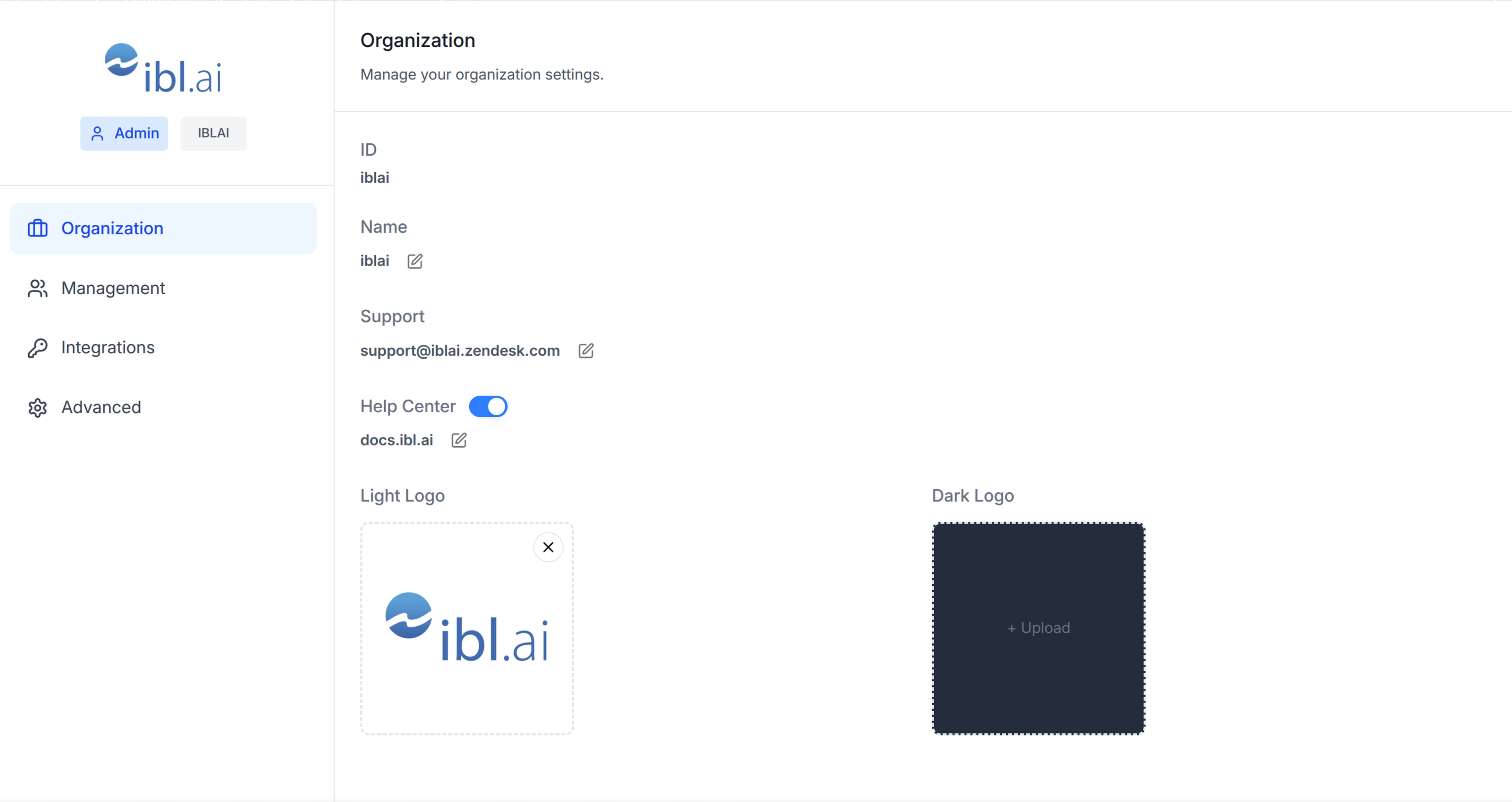
Template: the page this skill creates is bundled as
[assets/account-page.tsx.j2](assets/account-page.tsx.j2). See
[/iblai-vibe-scaffold](../iblai-vibe-scaffold/SKILL.md) for the{{ }}contract.
Do NOT add custom styles, colors, or CSS overrides to ibl.ai SDK components. They ship with their own styling. Keep the components as-is. Do NOT implement dark mode unless the user explicitly asks for it.
When building custom UI around SDK components, use the ibl.ai brand:
- Primary:
#0058cc, Gradient:linear-gradient(135deg, #00b0ef, #0058cc) - Button:
bg-gradient-to-r from-[#2563EB] to-[#93C5FD] text-white - Font: System sans-serif stack, Style: shadcn/ui new-york variant
- Follow the component hierarchy: use ibl.ai SDK components
(@iblai/iblai-js) first, then shadcn/ui for everything else (npx shadcn@latest add <component>). Do NOT write custom components when an ibl.ai or shadcn equivalent exists. Both share the same Tailwind theme and render in ibl.ai brand colors automatically.
- Follow BRAND.md for
colors, typography, spacing, and component styles.
You MUST run /iblai-vibe-ops-test before telling the user the work is ready.
After all work is complete, start a dev server (pnpm dev) so the user can see the result at http://localhost:3000.
iblai.env is NOT a .env.local replacement — it only holds the 3 shorthand variables (DOMAIN, PLATFORM, TOKEN). Next.js still reads its runtime env vars from .env.local.
Use pnpm as the default package manager. Fall back to npm if pnpm is not installed. The generated app should live in the current directory, not in a subdirectory.
Navbar: If the user wants a navbar with links to the account page,
guide them to/iblai-vibe-navbarfirst. That skill creates the full navbar
with logo, page links, notification bell, and profile dropdown.
Common setup (brand, conventions, env files, verification): see docs/skill-setup.md.
Step 0: Start from vibe-starter? (new projects)
Before running this skill, ask the user:
Are you starting a new project from scratch? vibe-starter
(https://github.com/iblai/vibe/tree/main/skills/iblai-vibe-ops-init/assets/vibe-starter) already ships the /account
page wired up, alongside auth, navbar, and profile/notifications. Want to
use that instead?
If yes, copy the bundled starter template from the installed iblai-vibe-ops-init skill's assets/vibe-starter/ directory (a sibling of this skill's directory), or fetch it from the vibe repo if those assets are not installed -- tell the user which path you took -- then skip this skill:
cp -a <skills-dir>/iblai-vibe-ops-init/assets/vibe-starter/. . # or, without local assets: git clone --depth 1 https://github.com/iblai/vibe.git vibe-tmp && cp -a vibe-tmp/skills/iblai-vibe-ops-init/assets/vibe-starter/. . && rm -rf vibe-tmp
pnpm install --ignore-scripts
Run with
--ignore-scriptsto skip package lifecycle (postinstall) scripts.
If they prefer to add the account page to an existing app, continue below.
Prerequisites
- Auth must be set up first (
/iblai-vibe-auth) - MCP server + skills configured (
@iblai/mcpin.mcp.json)
Step 1: Check Environment
Before proceeding, check for a iblai.env in the project root. Look for PLATFORM, DOMAIN, and TOKEN variables. If the file does not exist or is missing these variables, tell the user: "You need an iblai.env with your platform configuration. Download the template and fill in your values: curl -o iblai.env https://raw.githubusercontent.com/iblai/vibe/refs/heads/main/iblai.env"
Step 2: Create the Page
Render [assets/account-page.tsx.j2](assets/account-page.tsx.j2) into app/(app)/account/page.tsx (substitute {{ }} placeholders), or just use the reference implementation in Step 3.
Files created
| File | Purpose |
|---|---|
app/(app)/account/page.tsx |
Account/organization settings page with tabs |
The page reads userData, tenant/current_tenant, and tenants from localStorage. Admin status is derived from the tenants array.
Note: The
Accountcomponent usesnext/imageinternally -- it is
imported from@iblai/iblai-js/web-containers/next.
Step 3: Wrap in a White Container
The SDK Account component has no outer background. Wrap it in a white container so it renders as a card against the gray page background (--sidebar-bg: #fafbfc).
Reference implementation
// app/(app)/account/page.tsx
"use client";

import { useEffect, useState } from "react";
import { useRouter } from "next/navigation";
import { Account } from "@iblai/iblai-js/web-containers/next";
import config from "@/lib/iblai/config";
import { resolveAppTenant } from "@/lib/iblai/tenant";

export default function AccountPage() {
  const router = useRouter();
  const [username, setUsername] = useState("");
  const [email, setEmail] = useState("");
  const [tenantKey, setTenantKey] = useState("");
  const [tenants, setTenants] = useState<any[]>([]);
  const [isAdmin, setIsAdmin] = useState(false);
  const [ready, setReady] = useState(false);

  useEffect(() => {
    try {
      const raw = localStorage.getItem("userData");
      if (raw) {
        const parsed = JSON.parse(raw);
        setUsername(parsed.user_nicename ?? parsed.username ?? "");
        setEmail(parsed.user_email ?? parsed.email ?? "");
      }
    } catch {}

    const resolved = resolveAppTenant();
    setTenantKey(resolved);

    try {
      const tenantsRaw = localStorage.getItem("tenants");
      if (tenantsRaw) {
        const parsed = JSON.parse(tenantsRaw);
        setTenants(parsed);
        const match = parsed.find((t: any) => t.key === resolved);
        if (match) setIsAdmin(!!match.is_admin);
      }
    } catch {}

    setReady(true);
  }, []);

  if (!ready || !tenantKey) {
    return (
      <div className="flex flex-1 items-center justify-center">
        <p className="text-sm text-gray-400">Loading account settings...</p>
      </div>
    );
  }

  return (
    <div className="mx-auto w-full flex-1 overflow-auto px-4 py-8 md:w-[75vw] md:px-0">
      <div className="rounded-lg border border-[var(--border-color)] bg-white overflow-hidden">
        <Account
          tenant={tenantKey}
          tenants={tenants}
          username={username}
          email={email}
          mainPlatformKey={config.mainTenantKey()}
          isAdmin={isAdmin}
          authURL={config.authUrl()}
          currentPlatformBaseDomain={config.platformBaseDomain()}
          currentSPA="agent"
          onInviteClick={() => {}}
          onClose={() => router.push("/")}
          targetTab="organization"
          showPlatformName={true}
          useGravatarPicFallback={true}
        />
      </div>
    </div>
  );
}
Key patterns
- White container wrapper: Wrap the
Accountcomponent in a
bg-white rounded-lg border border-[var(--border-color)] overflow-hidden div so it renders as a card against the gray page background.
- Responsive width:
w-full px-4on mobile,md:w-[75vw] md:px-0
on desktop.
Step 4: Use MCP Tools for Customization
get_component_info("Account")<Account> Props
Required
| Prop | Type | Description |
|---|---|---|
tenant |
string |
Platform key |
tenants |
Tenant[] |
Full list of user platforms from localStorage |
username |
string |
Username |
email |
string |
User email (from userData in localStorage) |
mainPlatformKey |
string |
Main tenant key — config.mainTenantKey() |
onInviteClick |
() => void |
Called when "Invite user" is clicked |
onClose |
() => void |
Cancel/close callback |
authURL |
string |
Auth service URL |
isAdmin |
boolean |
Controls tab visibility -- most tabs require true |
Optional
| Prop | Type | Description |
|---|---|---|
targetTab |
string |
Initial tab: organization, management, integrations, advanced, billing, memory (the tenant Memory surface — see /iblai-vibe-memory) |
currentPlatformBaseDomain |
string |
Base domain for custom domain settings |
currentSPA |
string |
Current app identifier (e.g., "agent") |
billingURL |
string |
Stripe billing portal URL -- shows Billing tab |
topUpURL |
string |
Stripe top-up URL -- shows Billing tab |
enableRbac |
boolean |
Enable RBAC permission checks for Management |
showPlatformName |
boolean |
Show platform name badge in sidebar |
useGravatarPicFallback |
boolean |
Use Gravatar when no org logo |
Tabs
| Tab | Requires |
|---|---|
| Organization | isAdmin === true |
| Management | RBAC permissions |
| Integrations | isAdmin === true |
| Advanced | isAdmin === true |
| Billing | billingURL or topUpURL prop set |
Step 5: Verify
Run /iblai-vibe-ops-test before telling the user the work is ready:
pnpm build-- must pass with zero errorspnpm test-- vitest must pass- Start dev server and touch test:
``bash pnpm dev & npx playwright screenshot http://localhost:3000/account /tmp/account.png ``
Important Notes
- Next.js required: Import from
@iblai/iblai-js/web-containers/next(usesnext/image) - Redux store: Must include
mentorReducerandmentorMiddleware initializeDataLayer(): 5 args (v1.2+)@reduxjs/toolkit: Deduplicated via webpack aliases innext.config.tscurrentPlatformBaseDomain: Must be{config.platformBaseDomain()}— uses the config helper, not a raw env var. This is correct and intentional.- SDK hardcoded styles: The SDK Account component uses
bg-whiteand
bg-gray-50 internally. Do NOT override these. Instead, wrap the component in a white container so it renders correctly against the gray page background.
- Brand guidelines: BRAND.md